How to Choose Colors for Your Modern Quilts
Posted by Sylvia Schaefer on Aug 6th 2019
I'm Sylvia Schaefer, author of The Quilter's Negative Space Handbook, and I wanted to share a little bit more about choosing colors for your quilt after you've used the techniques in my book to design your masterpiece! My book is intended to help you design your own modern quilts using negative space by starting with a traditional quilt or quilt block and then applying different design principles. I take you through the design process step by step. The book also includes patterns for many of the quilts, but in several cases the quilt is made in different colors than are shown in the step-by-step illustrations. This is because a great design can work in many colors!
One of the first quilt designs that I go through in the book is for Northern Lights, the quilt which is patterned in Chapter 3. I like to use electronic tools to design quilts, and I used a block from the Electric Quilt library to work out the original quilt design. These colors are the default colors from the software.

I could tell that it was a good design, but the colors didn't do much for me, so I was on the hunt for something that appealed to me more. Sometimes I find that the shapes make me think of something, and in this case several ideas sprung to mind. (The quilt in Chapter 8, Jewel Drop, is another good example of the design reminding me of something that was able to inspire the color scheme; in that case iPhone games where you have to clear jewels off a board.)

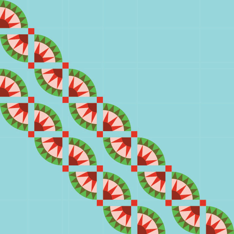
It must have been hot when I was originally playing with these colors, because the quarter circles of the blocks made me think of watermelons, and that's the color scheme you see in the step-by-step illustrations of the quilt design. I really must make this version sometime soon—I can't resist a good watermelon.

However, the wavy lines created by the New York Beauty blocks also reminded me of the Aurora Borealis, or northern lights.
Many photos that you can find of the northern lights include both pink and green colors, so my first attempt at recoloring included both of those colors.

I felt like the pink was somewhat overpowering, so I tried just sticking to the greens.

That felt right, and this color scheme became the finished quilt.

Even after I find a color scheme I really like, I'll often keep playing for a while just to make sure I can't come up with something I like even better. Here are a few more I tried, just for fun.
The spikiness of the blocks made me think of the American Southwest, so I tried a dusty Southwest-inspired color scheme with turquoises and tans. Brown and tan aren't usually colors I go for, but I rather like this one.

If the shape of the blocks or the design of the quilt doesn't inspire you, it's worth turning to the color wheel (there are lots and lots of resources out there for learning about the color wheel and color schemes, just try a search!). Purple, orange, and green make a triadic color scheme, and create a striking design. Don't feel like you have to stick to the exact shades of color that a scheme derived from a color wheel provides; there's lots of room for tweaking!

Pink and lime are opposites on the color wheel, another combination that can make for a very striking quilt. I don't know that I'd like a quilt as big as Northern Lights in such bright colors, but for a smaller quilt this is a fun one to keep in mind.

So, I hope that once you come up with a design you spend some time playing around with colors to see what appeals to you. Do try some colors that you wouldn't usually choose—you might just surprise yourself with how much you like a color combination that's out of your usual box!


