Front Cover Design: Start to Finish
Posted by April Mostek on Sep 21st 2017
The process of designing a cover usually begins during a meeting called the Focus Meeting, attended by the Publisher, the Marketing and PR Manager, the Creative Director, and members of the book team. The title and subtitle are discussed, and decisions are made on how best to approach the cover.
What is the main purpose of the book? Is it a project-based book, or is the author teaching a process? Will the book have styled photography?
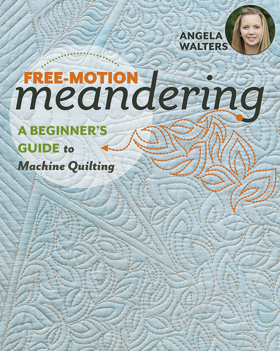
Usually if the book will not have styled photos inside the book, a styled photo will not be used for the cover. Often, the drawback of a styled photo is that a quilt is slightly obscured by the setting of the photo. A book based on a detailed process really benefits from a flat shot, so the reader can really see the results of what the author teaches. This is especially true for a book about quilting, such as Angela Walter’s new book, Free-Motion Meandering.

However, a styled photo tends to be more inspirational and conveys an overall sense of style from the book. In Jera Brandvig’s Quilt As-You-Go Made Vintage , the styled photo shows a variety of quilts, but the full quilt designs are not easily apparent. However, the setting and the props used give a sense of the vintage style and colors.

Is there one “wow” project that would communicate what to expect inside the book or is it more important to show the variety of projects?
Christina Cameli’s book, Wedge Quilt Workshop, was an exception to a few rules. The book does have styled photography, and the variety of designs created from wedges is an important selling point for the book. Ultimately, we chose not to use a styled photo or show multiple quilts, however, but rather one stunning quilt detail that really highlights the wedge shapes used in the quilt. Wedges are often assumed to be found in radial designs, so by showing a more unconventional wedge quilt, the cover still conveys variety and finding unexpected patterns.

Once a cover design has been strategized in the Focus Meeting, the information is passed first to the photographer for any photography requests, and then finally to the designer to put it all together.
As the designer, my process usually starts with research: all the documented meetings about the book, the author’s online presence and style, and also the competitive covers out there to see what needs to fit in and what needs to stand out.
Once materials are gathered and I have a pretty good base knowledge, I start throwing things together. In the beginning, it really is like tossing things around to see how they fit (very similar to working with a design wall). I start with fairly basic fonts just to see how the title works on the page, and then I work with font combinations to maximize the style and readability of the final work.
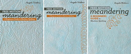
Three to six cover options are presented in an audition to the CEO, the Publisher, and the Creative Director. A cover option is chosen and refined, then sent to the author for their input and approval. Here are a few cover “sketches” from Free-Motion Meandering (final cover shown above).


