Auditioning Colors in the Design Process
Posted by Jean Wells on Jan 25th 2018
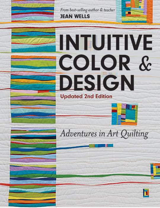
From Jean Wells, author of Intuitive Color & Design, Updated 2nd Edition.
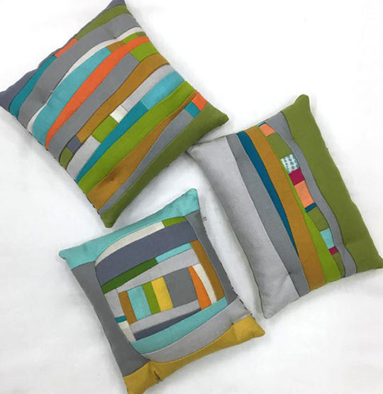
As quilters, when we audition possible fabrics for projects, it is
difficult to make a final decision until we actually see them interacting with
each other. It is hard to tell what is going to work. For years, I have sewn
together small (approximately 6 ½”) log cabin-like units, and I can quickly see
how the fabrics are interacting. I always make myself do more than one project,
and change up the proportion of color that is used in each one. So many
times after this process, I have changed my mind from what I was
envisioning, and then started the larger project more confident about my color
choices.
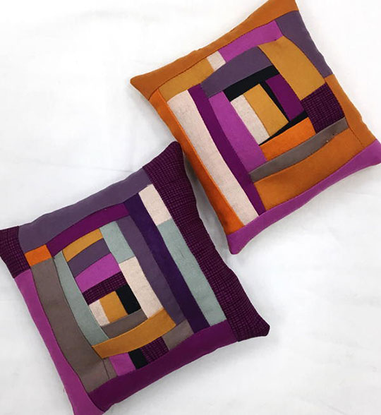
The important words here are “Proportion of Color”. It is the percentage of a
color family that you see in relationship to the whole. Always ask yourself,
"What color family do I want the piece to read?" Then the others in
the group should support the main color. I like to think of colors in
descriptive words like value, intensity, temperature, volume, contrast (like
opposites on the color wheel). Descriptive words help you to be more objective.
I find myself digging around in my scrap bag from time to time looking for a
“bright” or “dark”, etc., and more options appear to me when I use these words
rather than the name of a color, like a perfect red.
I recently challenged myself with a color combination new to me. I happened to
be straightening and rearranging our selection of
Kona solids at the store. I came upon this cheddar like orange
and the violets. Then I saw the dull violet! I could hardly wait to play with
the color combination new to me. Note how I changed up the proportions of the
two main colors in each of the projects.
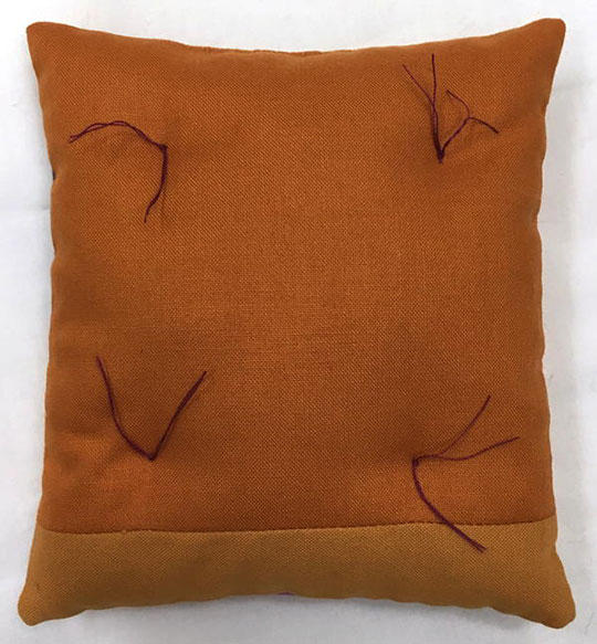
I like to fill my pincushions with crushed walnut shells. You can buy them from your local quilt shop or a pet store. After I have stitched up the opening, I tuft the pincushions in four places using a longer needle and doubled sewing thread. I pull the thread through from back to front and back again and tie them off. (See photo below.)
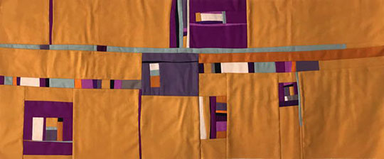
Then, I went on to working on this piece, as I taught my Adventures in Art
Quilting workshop series at The Stitchin’ Post. Originally, I thought I would
use the soft orange linen as the main color, but it just did not work. I ended
up with a lot of cheddar but the proportions of the various colors seem to
work. It is layered up ready for quilting. One of my students suggested
quilting Southwest Indian ruins in the open spaces as she felt it had a
Southwest feeling. I like the idea. Maybe I was thinking about the upcoming
workshop that I will be teaching for
Madeline Island School of the Arts in Santa
Fe, New Mexico at the Loretto Resort. I am teaching Spontaneous Designs from
Nature April 16 – 20.
Share you exploration into color choices. I love seeing the work that all of
you do.
-- Jean


